- Year
- 2022
- Client
- Lemaire ingenieurs
- Services
- Branding
- Photography
- Websites
- Link
- Lemaire-ingenieur.be
Lemaire Ingénieurs
Brand image & brand identity
B.E.L knew the importance of standing out from the crowd and was reaching a major milestone of their history….it was time for a complete brand overhaul.
Far from being a new player in the construction business, B.E.L benefited from a good brand awareness among prospects…but “good” is not good enough if you want to remain at the top of your market.
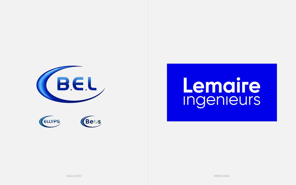
In addition to the strength of their brand awareness, they had a complicated 3-sided brand identity, operating under 3 different names: B.E.L, BEOS, and ELLYPS.
The mission was clear, but far from simple: Aiming for an impactful brand identity and a simplified & stronger brand image for the group.
Re-inventing the bureau
We spent a considerable amount of time with B.E.L’s teams to assess, measure and process the fusion of their 3 brands/companies into a single corporate entity.
As any change management mission, things tend to become subjective very quickly…good thing that it wasn’t our first rodeo: through collaborative workshops, we broke thing down step by step to build them back up in a way that made sense for everyone:
- Clarification of the roles and activities of each company
- Branding strategy for the fusion on 3 entities
- Impact assessment of each scenario of the impacts
- Proposal of different scenarios: branded house, house of brands, unique group brand, etc
- Competition analysis
Kaboom…B.E.L, BEOS and Ellyps were no more: Lemaire ingenieurs was born !
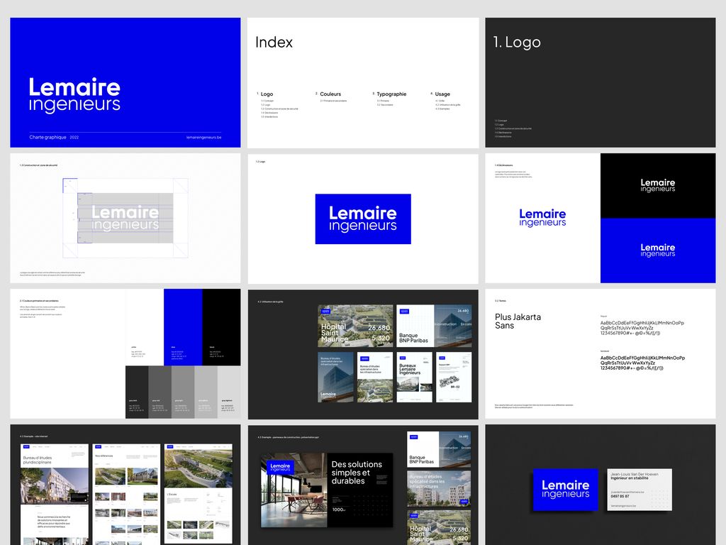
Visual identity
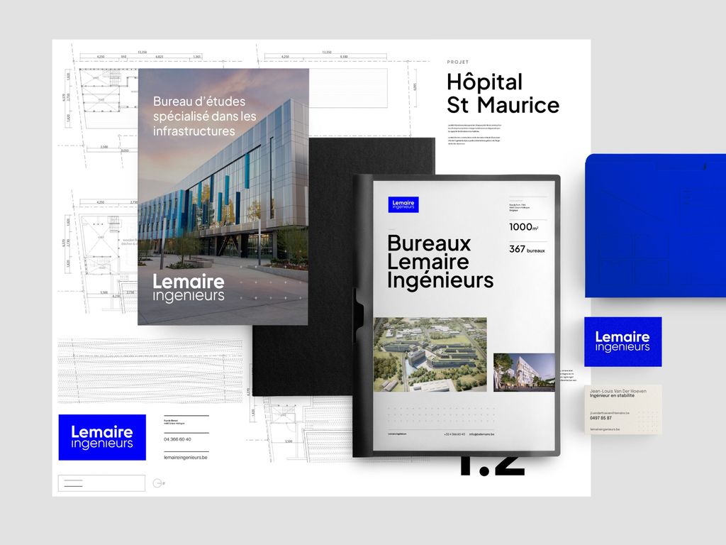
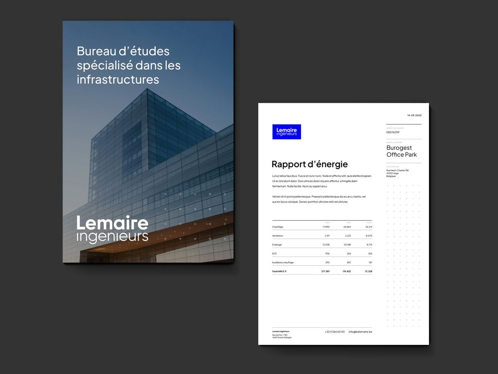
The brand strategy was defined and now had to be translated into a brand identity: Logo, typographies, colors…everything was completely re-designed!
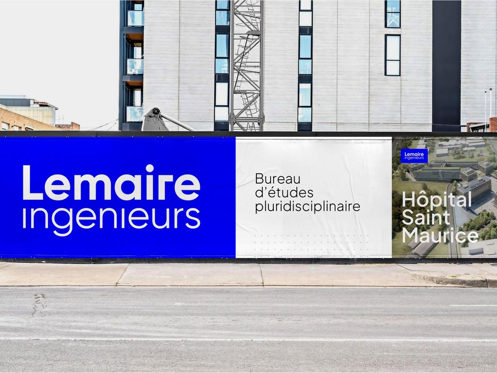
Given Lemaire ingenieur’s activity sector, we had to take into account very specific criteria like “visually standing out from 20 other banners on a construction site” or “being clearly legible from far away”.
The overall identity also had to convey the renewed values of the group: leadership, modernity, human-centricity, and reliability.
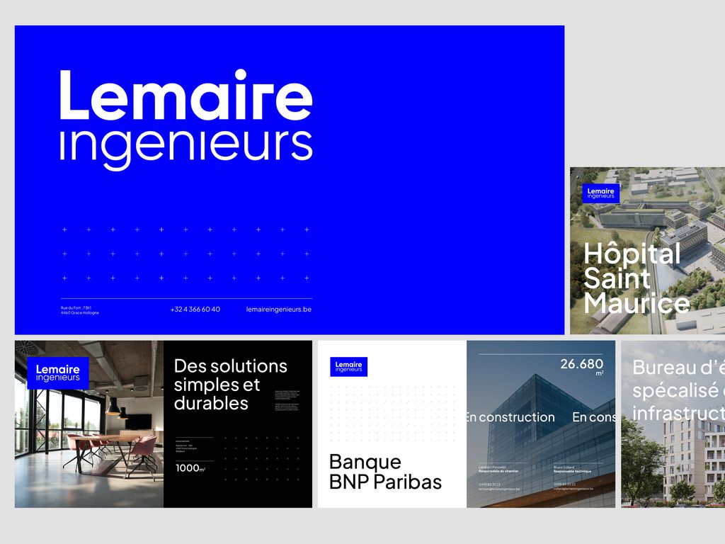
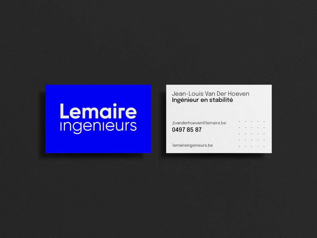
This gave life to a powerful and compact logo sided with sharp & highly contrasted color combinations.
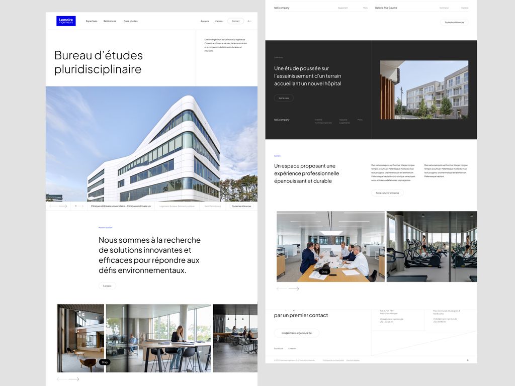
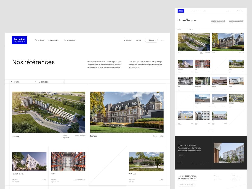
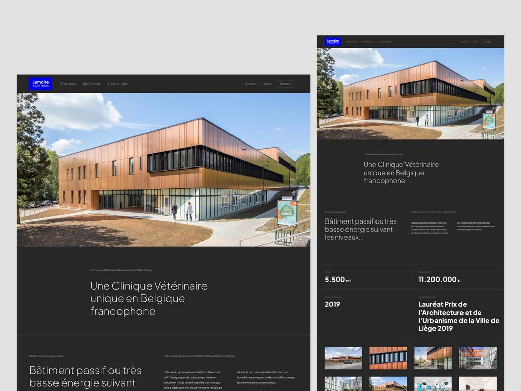
Immersive portfolio
A new brand strategy + brand new headquarters couldn’t go without a new website (trust us, the previous one was better off as a distant memory 😅)!
2 key business objectives were defined for the new website during the preliminary workshops:
- 1 – Highlighting the references and business cases
- 2 – Turning prospective visitors into client (yeah, we bet you didn’t see that one coming)
We worked on a filtered & tagged showcase system for all of Lemaire ingenieurs’ projects: any visitor can now easily browse through any kind of reference and is showed linked case studies to increase content consumption.
In terms of page transition, we developed small yet (hopefully) effective integration of project images (hover effects, deep immersive header image transitions) to immerse visitors as much as possible into the different references.
To improve conversion, we scattered quick-access contact CTA’s in the footer, main menu and general chrome of the website; if a visitor doesn’t know how to reach Lemaire ingenieur at this point, there isn’t much we can do for them.
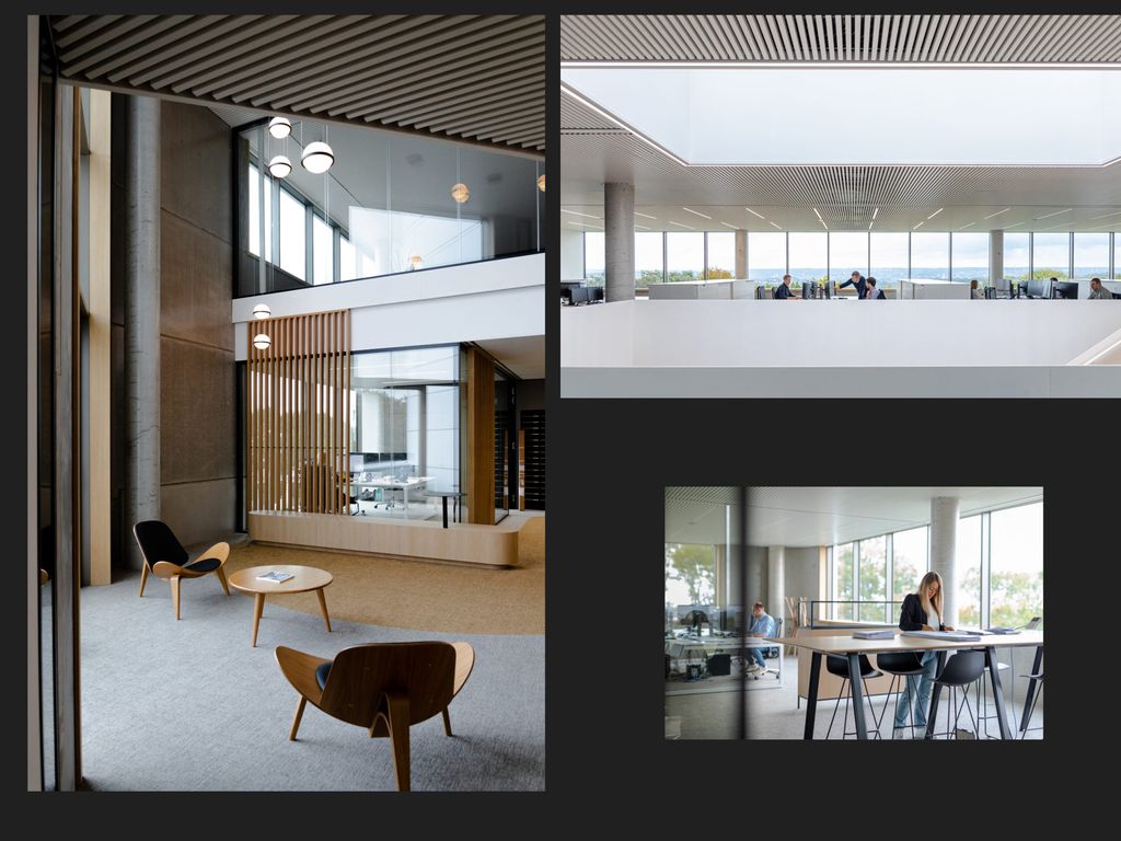
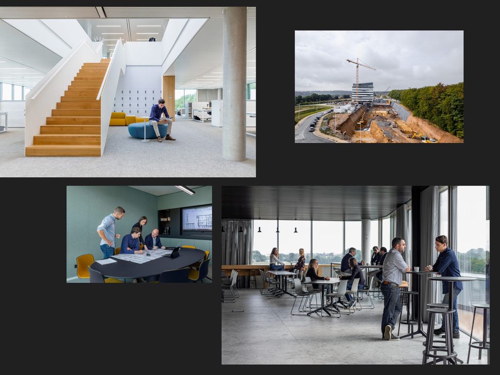
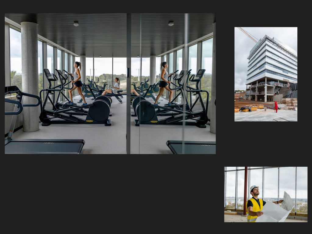
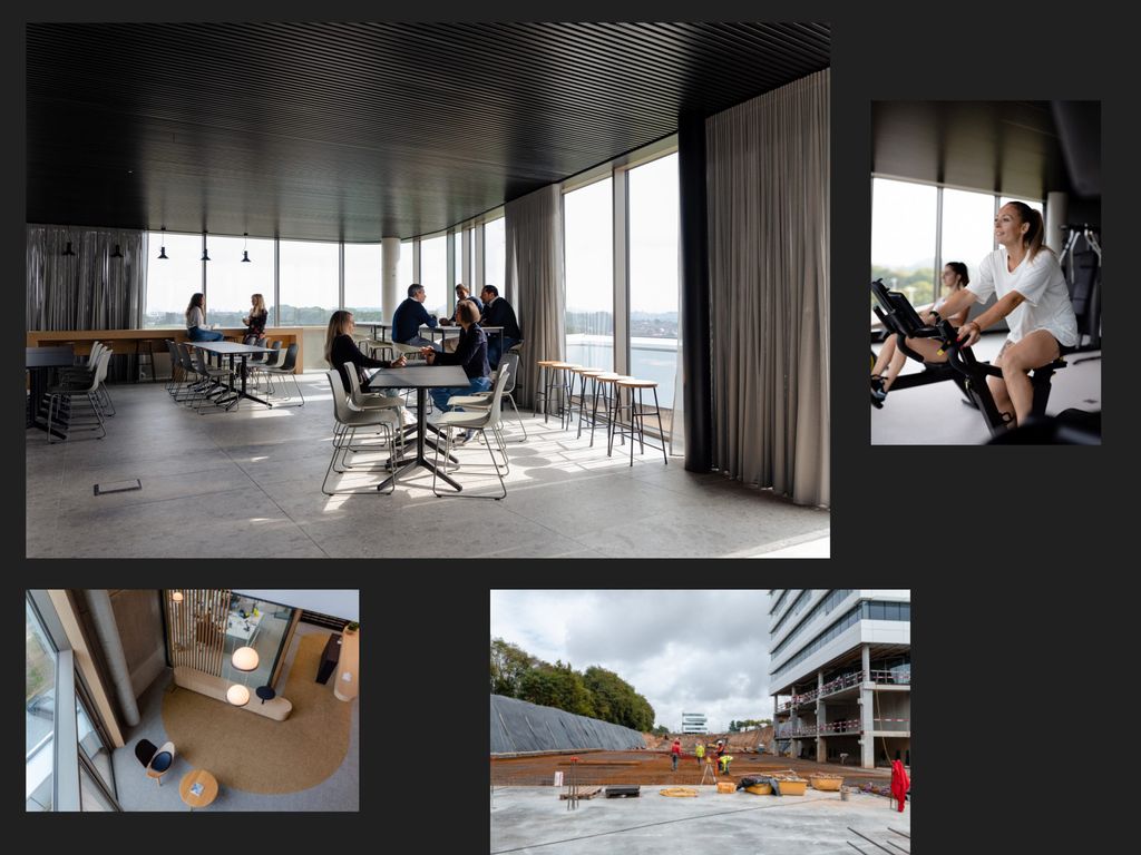
Where is the gym?
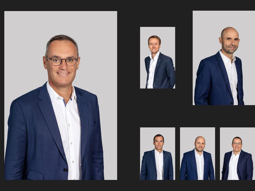
Lemaire ingenieurs recruits quite a lot. This means that potential talents are a key persona among their website’s visitors.
To explain what the bureau is all about in terms of value, work environment and overall employer branding, it seemed only fair to move faaaaaar away from image banks of multicultural teams shacking hands. So we organized a photo shoot. We wanted to show the real people behind the group, staff and management included !
Double bonus: the photo shoot could take place in their brand new headquarters; leading to amazing views of the new work infrastructure with their staff posing without knowing it (almost….we are aware of GDPR and image reproduction rights). Even the management board tagged along for a more formal photo shoot.